BILLIE JEAN KING CUP
THE PROBLEM
The Billie Jean King Cup (BJKC), formerly the Fed Cup, faced the challenge of redefining its strategy and identity to reflect its standing as the world’s premier international team competition in women’s tennis; elevating the game and the competition, whilst communicating the bigger purpose that the Billie Jean King Cup aims to have.

THE APPROACH
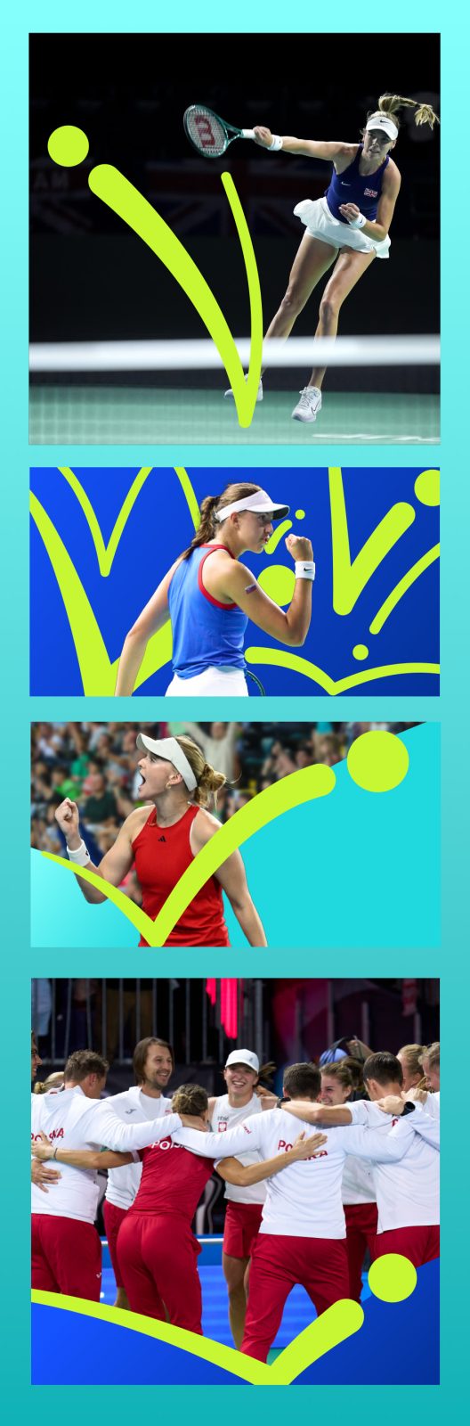
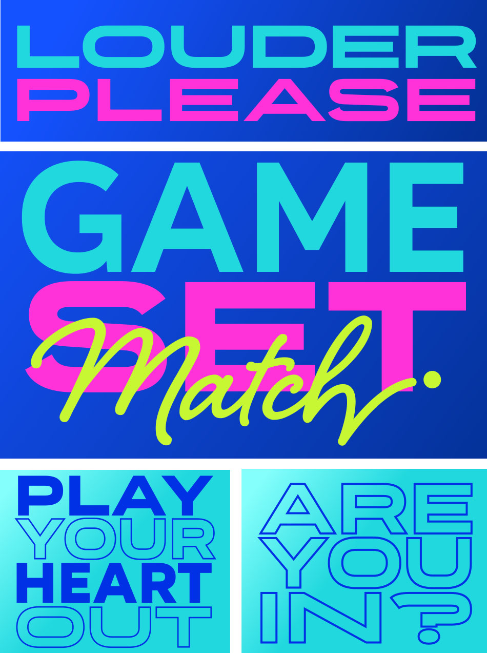
Inspired by tennis’s blend of precision and the competitions unique aspect of teamwork, that creates both national unity and positive rivalry, the strategic brand essence of ‘Louder, Brighter, Together’ was developed. Drawing on our immersive research into tennis, women’s sport, female empowerment, and team dynamics, we crafted a new brand strategy and visual identity that captures the rhythm and energy of the game. Tennis-inspired iconography, the bold ‘Billie Blue’, ‘Competition Teal’, and ‘Bounce Yellow’ colour palette, and dynamic typography reflect the excitement of a rally. Billie Jean King’s handwritten signature adds authenticity and ties her legacy to the Cup’s fresh and modern identity.
THE SOLUTION
The rebranding has transformed the Billie Jean King Cup into a bold celebration of women’s tennis. The new strategy and vibrant identity energises every touchpoint, from on-court visuals to digital platforms, embodying the spirit of collaboration and empowerment. By weaving together the dynamism of tennis, the distinctive national team aspect of the competition, and the mission of Billie Jean King herself, the rebrand positions the competition as the pinnacle of team tennis and a beacon for gender equality in sports. Like a perfect serve, the new strategy and identity lands with impact, uniting players, teams, and fans worldwide.