SCHOLL
THE PROBLEM
Scholl, a renowned brand with a vast product range, lacked a unified brand image. Despite being recognised as ‘footcare experts’ in the past - smaller, niche brands were gaining market share. Our challenge was to re-establish Scholl as category leader and help it stand out from the competition.
THE APPROACH
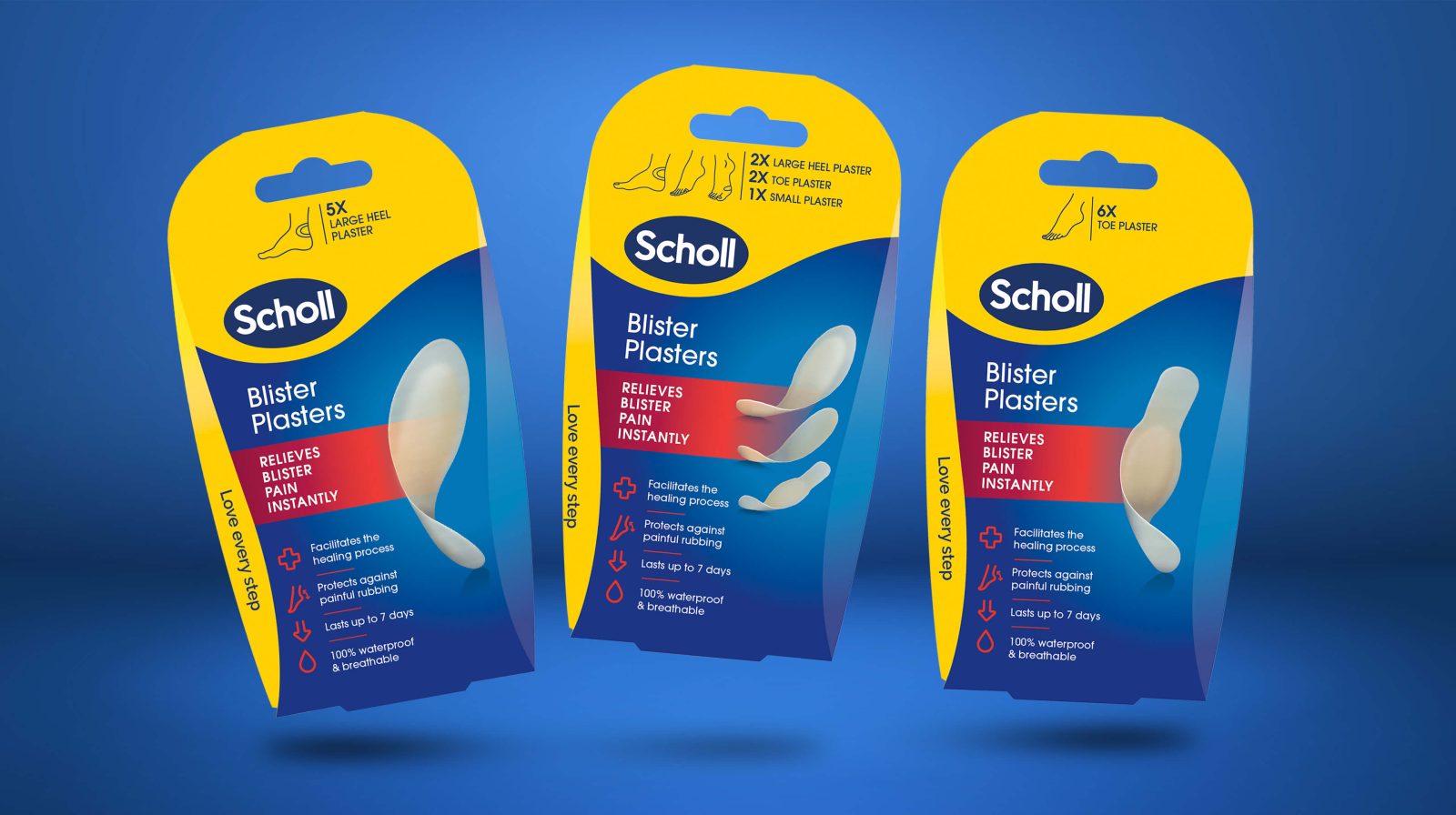
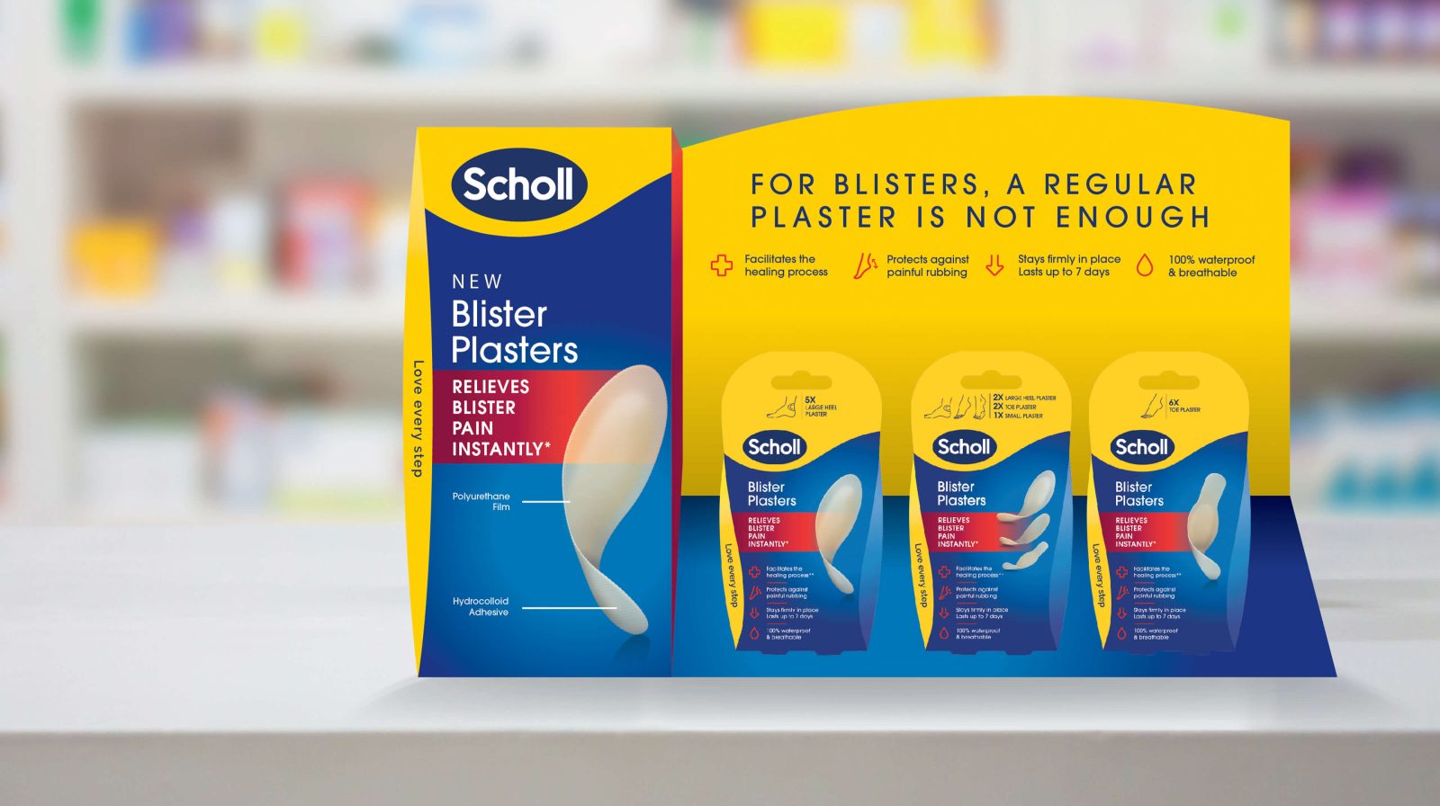
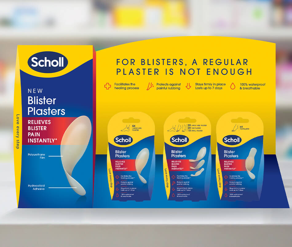
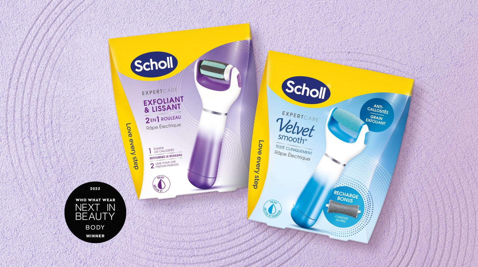
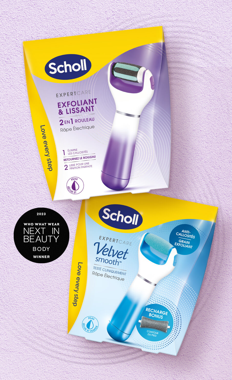
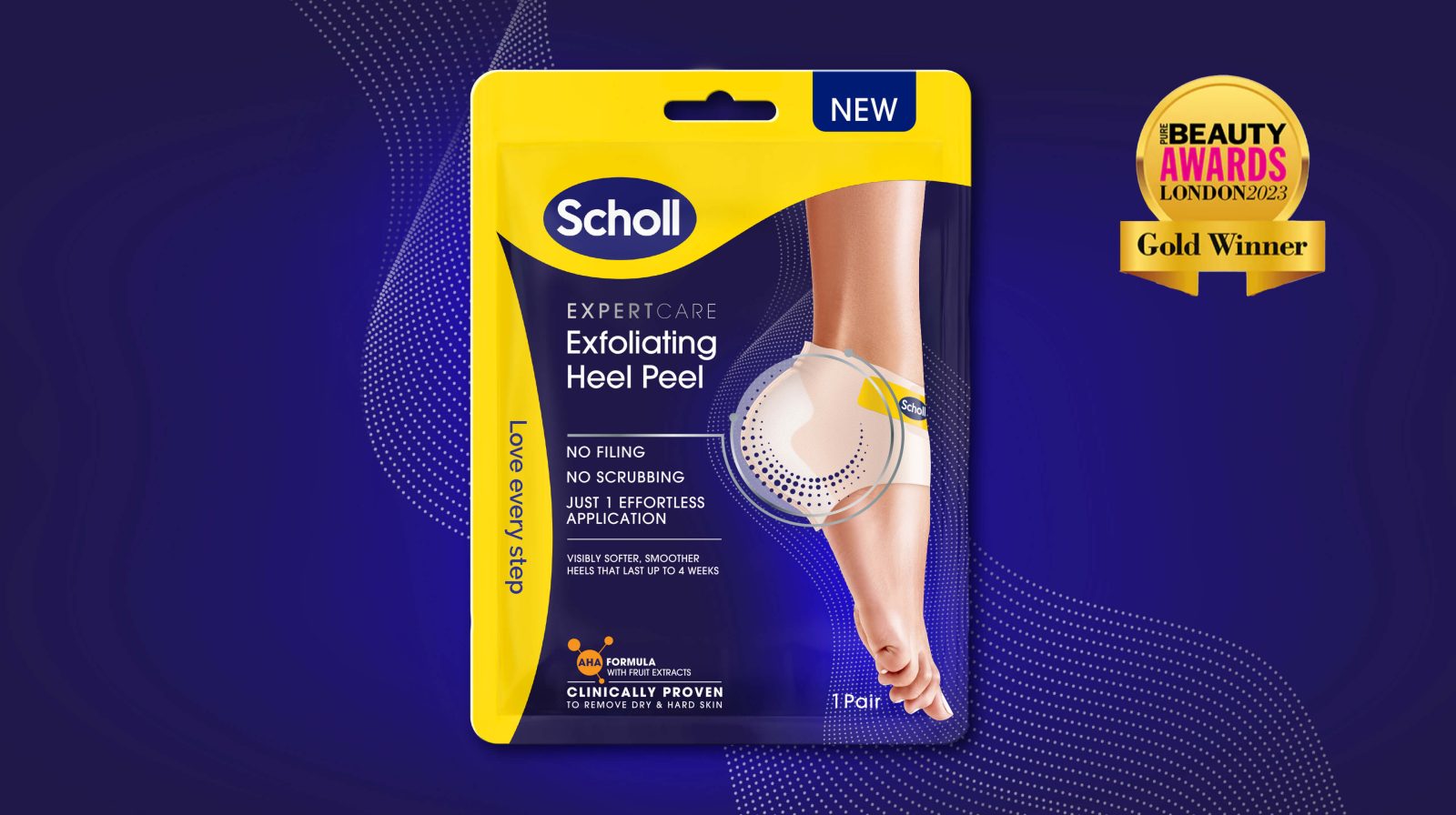
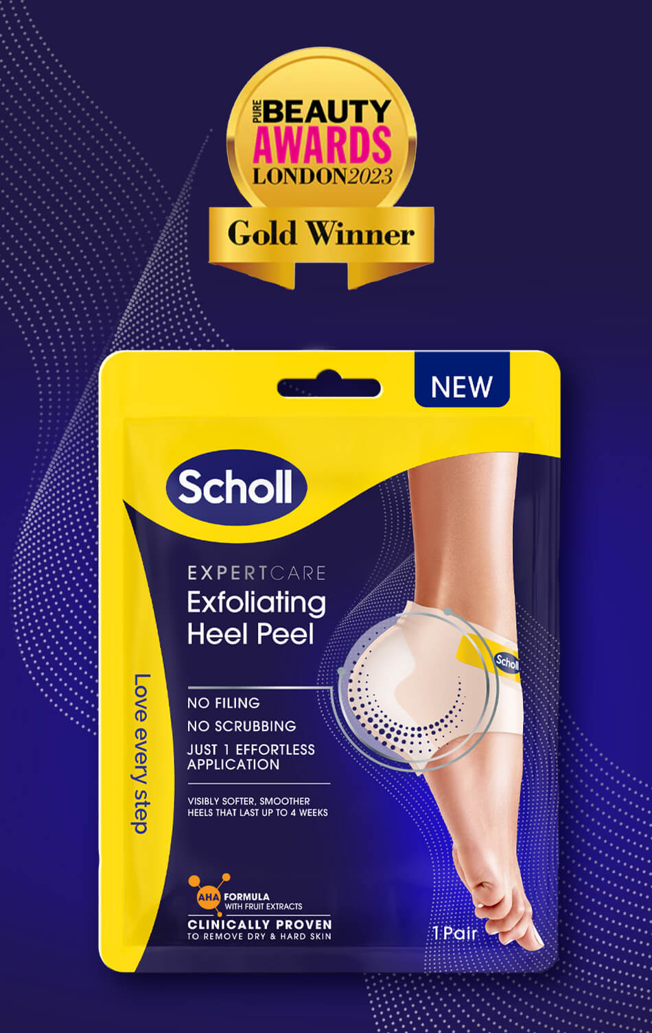
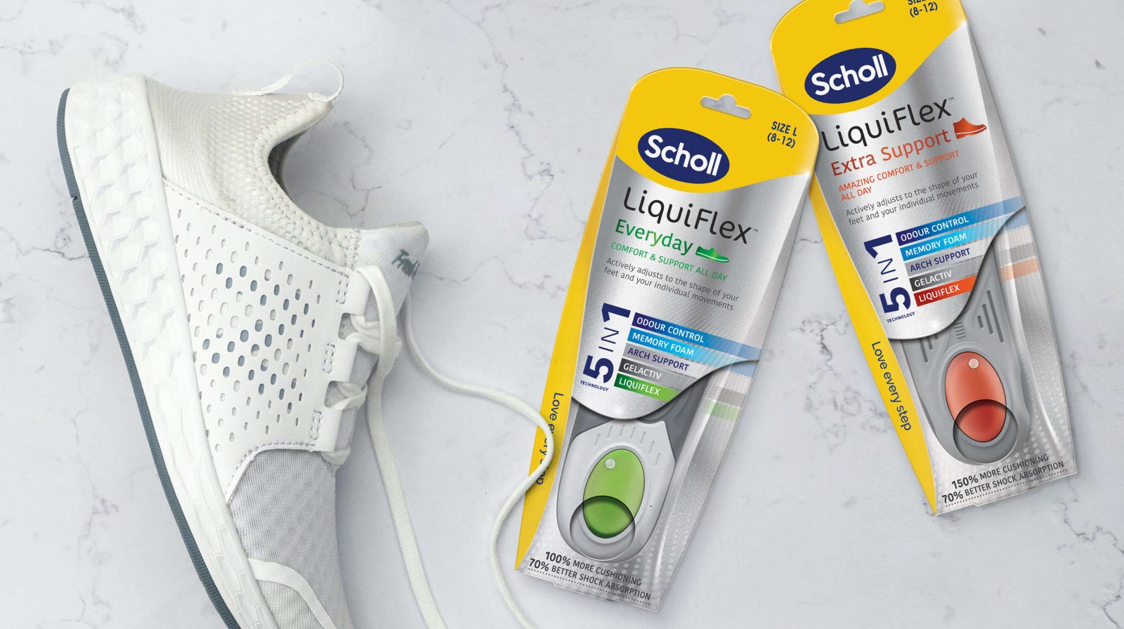
We helped Scholl through a strategic brand realignment, integrating its product range under a unified brand identity. Focusing on the Aid, Care and Comfort pillars crucial for navigating Scholl's product range, our strategy involved creating a clean and contemporary update of the logo, accompanied by an identifying super graphic. This visual representation brings the Scholl brand's positioning of "Love Every Step" to life and creates maximum impact at point of sale.
THE SOLUTION
By owning the colour yellow, Scholl’s brand visibility is enhanced whilst also allowing each range to showcase its unique personality. Now clearly differentiated, it effectively competes with smaller, more focused brands and its expertise and innovation are heightened through dynamic product visuals, ensuring the brand stays one step ahead - a reminder of why Scholl is ‘THE modern-day foot specialist’.
